Analyze student academic growth over time across Pear Assessment and external assessments in Data Studio.
The Performance Trends report in Pear Assessment Data Studio shows how student performance has changed over time across Pear Assessment and external assessments. Use it to filter and compare results, identify strengths and gaps, and recognize overall trends across student groups. This is an enterprise report available to administrators and teachers.
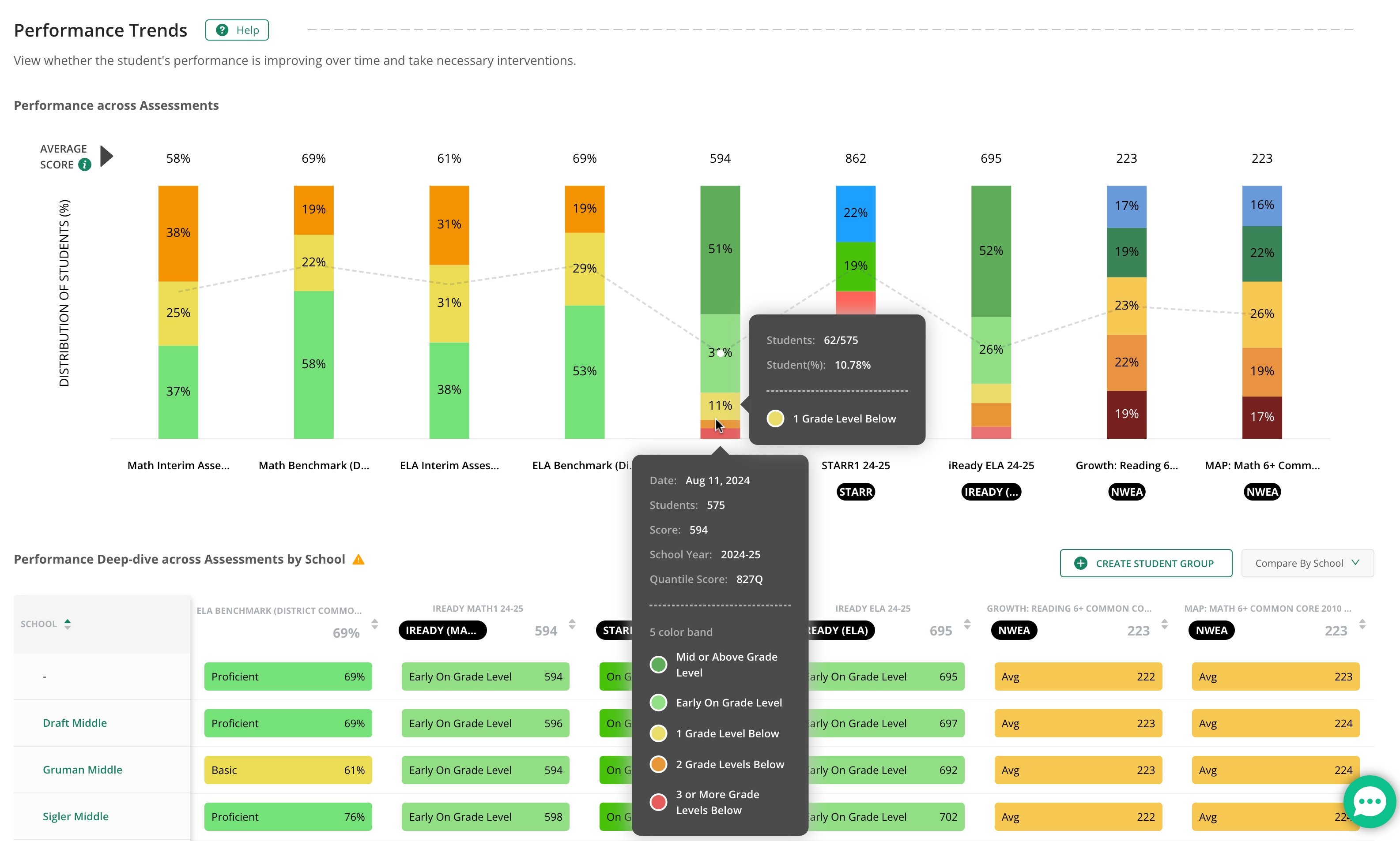
The Performance Across Assessments stacked bar chart shows how the distribution of performance levels has changed over time. Each bar represents an assessment ordered by start date. The dotted line on the chart represents the average score across all students.Hover over any bar to highlight it and see detailed performance information. Note that the Performance Band filter applies only to internal Pear Assessment tests — external assessments use their own band definitions.
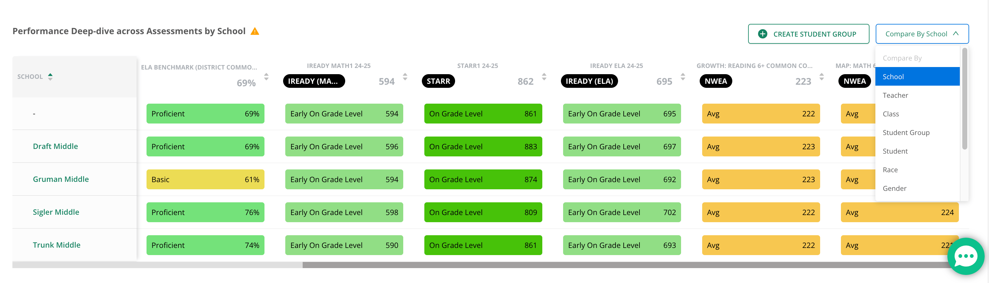
The Performance Deep-Dive Across Assessments table provides a detailed breakdown of performance data that you can compare across student groups. Use the Compare By dropdown to view results by school, teacher, class, student, race, gender, or other available demographics.For each assessment, the table shows:
Average performance band
Average score (percentage for internal assessments, scaled or raw score for external assessments)